Friday, 9 November 2012

Mapping project and Protest project


we have been given two new briefs that we have to choose between, I couldn't decide which one to do so I've decided to challenge myself and explore both. I feel both projects will be a very enjoyable and experimentative exploring a wide range of media and materials throughout a variety of techniques, for instance; collage, paint, maybe photographs and I'm might use the technique of screen printing.

I'm going to be looking at the Mapping Project first by exploring what activities I did during my weekend looking at things in detail, planning everything out to make my compositions easier to create.

Such as;


  • when I woke up in the morning
  • what I had for breakfast
  • people that I met or were there at the time
  • places I travelled to and how I got there 
  • Other things I ate throughout the course of the days
  • when I went to bed 


I will first do a plan of what my house looks like on the inside then do it again but in collage form.
Here is an image of my work;


Wednesday, 24 October 2012

My Complete Animation!

THE MYTHICAL OLYMPIC TORCH RELAY!


Its not perfect but I'm very happy with the outcome!

Creating My Animation!

Creating my animation over the past few weeks has been time consuming fun and a little stressful. Using
I-stop motion to capture my sequence of my animation has been very time consuming as I had to click every tiny movement I made. There were parts I needed a little help as it was difficult t manage two things at once. For instance I had to hold my fairy in the air and move her very slowly across the screen to make it look like she's flying and click the capture button at the same time and doing this at the same time was a little difficult.

Once I finished filming it felt such a relief to get it done, all I had to do now was to put it together using a format called 'After effects adobe' and add some sound to finish it off.

However I came to some problems!!

I found that the LED light that I used for the relay torch was attached to a battery with a long piece of wire and I didn't realize how in the way the piece of wire was throughout mostly every scene I have filmed. I was unhappy with this feature so I tried to get rid of it by using a format called photo shop to rub the wire out,using the rubber tool and if I couldn't rub out important parts I then had to use the clone tool to get rid of it. I found this also very time consuming and needed a lot of effort because of this I decided to re-film some of my scenes, as I found this was just much easier to do.

I then had to add sound to my animation once all the fiddling and manoeuvring of the scenes was put together. I also added some written sequences that were put in-between scenes to tell more of the story, these were produced throughout the format Photoshop.
I couldn't decide on two songs which I thought both went well with my animation and they are;
Keane - Spiralling
Duffy - stepping stones

At the end I chose the song 'spiralling' as I felt it had more of an up beat and umph!!


Discussion Forum 2

12th October 2012 

Throughout the duration of this day we had a discussion forum on an article called the 'creative review' written by Lawrence Zeegan. Zeegan is also an illustrator and educator teaching courses in advertise design for instance here a couple of images of his work;

This composition he created was for FM magazine called private finance initiative schools, libraries and hospitals!

This is an image he produced for the mail on Sunday in 'You magazine' called 'Anger'!

Zeegan looks at an artist called David Shrigley and argues weather or not his 'fight for nothingness' poster was giving a message or is it just filling a space!
Does Shrigley's work have comment or meaning?

Here is a picture of Shrigley's poster;
Shrigley's poster is exhibited outside his brain activity show at the Hayward Gallery in London!

Zeegan argues this further by looking at 'pick me up magazine in 2012' exploring the gallery of illustrated art and Zeegan thinks that art just looks lovely and doesn't really have any other purpose. Lots of illustrators will argue against this especially those who are starting out as they have so much to give. 

Quotes made by Zeegan expressing his views; 
       'Basically illustrator's don't have a point any more apart from making things just look nice'

'Illustration has withdrawn from the big debates of our society to focus on the chit - chat and tittle - tattle of inner sanctum nothingness.' 

Do you agree with this comment?

we then had to get into a group of three and write a letter as if it was going to be sent to Lawrence Zeegan.

This is what we wrote; 
      
Dear Mr Zeegan,
                           We are writing in response to your interesting article in Creative Review. Many of the points you made regarding the state of illustrators and illustration itself gave us, as illustrators something to chew on.
The reason why we've spent all this time and money to gather the seeds for our careers in this particular industry are because we have passion and we care about the state of design.
We appreciate the smaller obstacles, making art for arts sake as well as conveying a meaning. Sometimes thinking smarter, not harder (as you've mentioned I you're writing 'its all design, doing and design thinking)
is something people forget to do. But its not our fault, don't tar everyone with the same brush. Give th new generation of artists some time to find their footing, time to let the REST of the world know what illustration actually is..... and maybe you'll be in for a nice surprise.
Our work is based not only n our endlessly creative imaginations, but on the imaginations, ideas and opinions of others, your article should be sent out to the masses instead of targeting illustrators as a collective.
We are not the ones who set the bar, we follow by example but we learn from the world. you will know about us, don't worry about that.
                    
                                    Think smarter, not harder!
                                               Emma, Charlie and Kate x

Also in my view I feel illustrations have meaning and emotion and most of all tell stories.


Wednesday, 17 October 2012

Animation Update!

I had to make four different backgrounds for each of my scenes that I had to produce and they are;

The woodland Forest

The blue sky with clouds

The Dragons Cave

Inside the cave - utter black to give the effect of complete darkness inside the cave 

Here is an image of all my characters that will be presented in my unique and random animation.


After I finished making and creating al the things I needed to do to make my animation was to start filming which I was very excited about. The process I used to put my animation was a process called 'Istop motion' this is a very time consuming process yet easy and enticing to comprehend. I've loved every minute of filming and putting bits and pieces together. 

THIS NOT FINISHED!

Friday, 12 October 2012

Steven Berkoff

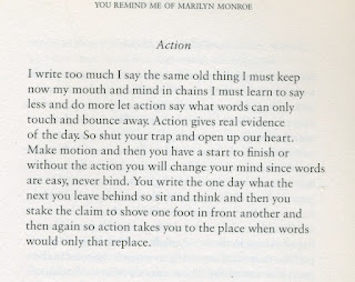
 This is a book which entails poems by Steven Berkoff, which consist of passion, violence and explore various personal themes. It also uses some language that is characteristic of his plays.
I found some of his poems very unique and influential, i felt i could relate to them throughout my work and just in general.

For instance here is a poem which i feel has a really good meaning, which I could definitely relate to;
Quote (page 57);


This next poem i feel relates to my first project of the film sequence of the 'Titanic' as i feel it consists of the love and passion Jack and Rose have together, feeling the romance between them.


Berkoff, SB, 2009. you remind me of Marilyn Monroe. 1st ed. London house: Herla publishing.

'Watch me move the animation show' (Book)

I recently visited the library and found a book exploring animation. There are various artists that I have researched throughout this book that I have found very intriguing, unusual and just down right spectacular  There were so many artists that I found so inspiring and unique that I'll only put a few up that were my absolute favourite.

For instance one of my all time favourite's are the creators of 'Wallace and Gromit and the curse of the were-rabbit' and they are Nick Park and Steve Box.

Nick Park is a British animator and film maker, his work is best known as the creator of 'Wallace and Gromit'. He studied at Sheffield polytechnic but is now called Sheffield Hallam university before going onto the National film and television school in Beaconsfield, Buckinghamshire, where he began working on 'A grand day out' the very first Wallace and Gromit film ever to be made.

Here are a couple of images from the film Wallace and Gromit the curse of the were-rabbit;


I also looked at the work of Tim Burton I love the films he produces for instance my favourite film created by him is called the nightmare before Christmas, I also like the corpse bride I find these films very unique and funky, the animation created is just incredible I think Tim Burton's work is very inspirational.

Here are some images from 'The Nightmare before Christmas';


I especially cant wait to see his new production of 'Frankenweenie' looks epic!


Saturday, 6 October 2012

Preparing for animation

Monday 1st October

Prepared to start my animation and finished off my storyboard.

Tuesday 2nd October

Started my animation by making my beginning scenes on the set and learning how to use the camera and how to pan, zoom, prevent different angles, exposure to light and using the focus.

Wednesday 3rd October

Started to make another of my mythical creatures, a fairy called "The Banshee". To create this model, I used a barbie doll. I painted her dress red, with a black belt. I painted her arms black to give the appearance of her wearing gloves and I also painted her legs black to look like she was wearing tights and I painted her hair black too, again using PVA glue, which was also very time consuming. For her wings, I drew them on paper, then painted them black and grey. I then had an idea of laminating them to make them stronger.

Thursday 4th October

I did some more filming, which was very enticing, however, I found out it was quite hard to hold something in the air for a long period of time, whilst clicking a button for each shot when it moves, because if I made a mistake, I would have to figure out where I was last holding my model in place, but its lots of fun and enjoyable even though it is a very time consuming process.

Friday 5th October

Made another mythical creature, called "Fred". I used a polystyrene sphere as his body and painted it black. I then used a plastic horses head for its head and for the bushy tail and legs, I used tough bendy wire as a structure.

Creating mythical creatures

Monday 24th September

I produced a mythical creature called the 'Burak' I first used a small plastic Giraffe as the base/structure of his body, I then covered the giraffe out of  pink plasticine to make my creature bigger and taller, I then moulded his head into a human face, then added peacock feathers to his bum, as a tail. I then painted my plasticine model with brown paint and craft PVA glue so it would stick to the plasticine better. This was quite time consuming, but I got there in the end.

I also created my other model, the "Ass with three legs". I used a plastic male sheep's body as the base, then again covered the whole of it in plasticine and painted him white with paint and PVA glue which I then moved on to mould his face with big ears and a horn sticking out of his head.

Tuesday 25th September

I had an after effects workshop, which i learned a variety of things to do after I had completed my animation, for instance, I could adjust things using a format called 'photoshop' and a format called 'illustrator'. I can also add sound if I chose to. These formats also allow me to rearrange layers and edit scenes that I may not wish to use and lots more as well.

I also did a few sketches in my sketchbook and started to plan my storyboard.

Wednesday 26th September

I created various background scenes for my animation on A2 sheets of paper, using watercolour paints. My background themes are:

  • Sky and clouds
  • Jungle/Forest
  • Cave Exterior
  • Cave Interior
Friday 28th September

Completed making 'Burak' and then added 6 googly eyes and a horn made out of tissue paper and 9 mouths used from red plasticine to my 'Three legged Ass'.

Discussion Forum 1
At 3 'o' clock, we had a discussion on the state of illustration, which was an audio/radio discussion. My opinion towards this is that I found illustration and fine art are both very similar. I also found out that illuminating art is like telling a story. I think the state of illustration discussion didn't really answer the question, as the artists just went off in their own worlds.

They also talk about many different forms that are included in illustration, like animation, photography, painting and collaging etc. There are also many ways now to show your work during this era, like youtube, facebook, the internet in general as well as galleries and exhibitions, as this time 5 years ago, we did not have access to all of this new digital media.

Saturday 29th September

Started to make paper 3D model trees, which I also painted and used a small squishy ball to give the effect of the leaves on the top of the trees.

Here is an image of my trees in action, ready for filming.


Sunday 30th September

Finished off a few of my backgrounds and research animation, looking at a book called, "Animation Now!" by Anima Mundi, edited by Julius Wiedemann.

Library

On 24/09/2012 I went to the Library and looked at a book called the 'History of art' Sixth Edition, Thames Hudson by H.W. Janson, Anthony F. Janson. (pg 777 twentieth century painting) I looked at an artist called Franz Marc, who created a composition using oil on a canvas called 'animal destinies'. His art is based on the unconscious use of animals in nature. Motivated by pantheistic feeling of the romantics which was heighted by his association with Kandinsky. The artist's paintings represent humanity's desire to return to a state of harmony with the universe.

Marc's colour symbolism is as personal as that of Van Gogh, who had inspired his early work.
       Quote: "Blue is the masculine principle, robust and spiritual.
                   Yellow is the feminine principle, gentle, serene, sensual.
                   Red is matter, brutal and heavy."

But it was orphism of Robert Delaney with who he formed friendship in 1912, the year of the Titanic, that showed Marc the full potential of colour to express his mystical beliefs.

What does Orphism mean?

Orphism, or Orphic Cubism, a term coined by the French poet, Guillaume Apollinaire in 1912, was an offshoot of cubism that focused on pure abstraction and bright colours influenced by fauvism.

I also researched Marc Chagall as I feel his dreamlike memories are similar to my own mystical creatures as they are both formed by the subconscious and creative side of the mind. For instance, I looked at a painting called, "I am the village" (1887-1985). This piece represents the power of nostalgia of a Russian who went to Paris in 1910, featuring dreamlike memories of Russian folk tales, Jewish proverbs and the look of Russia into glowing cubist vision.

Sunday, 30 September 2012

3D Model

On  Thursday 20th September I had to make a 3D model based on my second project of mythical creatures I decided to base my 3D model on a Chinese Dragon. The materials I used are silver bendy wire as the structure of the dragon like its skeleton for the base of the body. As i need the body to be strong but able to move. I then covered the wire in white plasticine to make it look more of a dragon then added coloured plasticine to make my dragon more colourful and interesting.

I will also use this 3D model as a character in my animation.

I looked at an artist called Jan Å vankmajer whom makes characters out of clay then uses them to make an animation. I also looked at the creators of Wallace and Gromit.

Here is some of his work;


Here is a picture of my 3D model!


These are also shots taken from a test sequence I did to test and explore how my creature was going to move during my animation.


I decided for my animation i would make all my characters 3D models however using a variety of materials and media. For instance, plasticine, feathers, paint, polystyrene sphere as a body for one of my models, ect.

Here are some images of my other creatures I have created!

Here is the finished product of my Chinese Dragon, he has horns, claws and scales, his backbone prickles with spikes, and later on in my animation he breathes fire.  
 side view

 close up of Dragons face

Here is my 3-D model of Fred an animal imagined by C.S.Lewis he has four legs, not much smaller than an elephant, he is very shy, has a bushy tail, a soft velvet nose, a long neck and whenever he moves he sings the most lovely of tunes!
 close up of Fred's face and front view of body

 This viewpoint is Fred's right side

This viewpoint is Fred's left side

Here is a shot of another 3-D model I made called the 'Burak', he has a man face, ears of an ass, a horses body, wings and tail of a Peacock. 
Burak means 'shining' this also means that some people see 'Burak' as a symbol of divine love.
'Burak of pureness of heart'


Here is a 3-D model of my fairy called the 'Banshee' she has pure Celtic blood her face is never seen as it is always hidden under her jet black hair, she is a barer of bad news, she is the women of the fairies, she has beautiful black and grey wings that she can fly with and she also wails when she is unhappy, in darkness, in danger or sometimes cause she feels like it.

These are all of my 3-D models that will be represented in my animation of 'The Olympic Torch Relay', this is the title name of my animation.


Tuesday, 18 September 2012

Storyboard

On Friday 14th September I was working on my storyboard for my animation. I started the beginning sequences by scanning my work onto the computer and then using a format called 'photo shop' to merge images together and to create a variety of scenes. 

Here is a couple of compositions I have created,


In this short sequence the Burak is stuck in the sand and the three legged Ass which is suppose to be this mythical creature that doesn't exist.......or does it, when it comes to save the Burak with its nine mouths.

I also went to the college library and borrowed a few books to do with animation.


Here is a quick sketch of my storyboard with important information like close up, wide angle shot, high angle shot, low angle shot, the vocal point of the scene, ect.

Quick sketch storyboard


Wednesday, 5 September 2012

Summer Adventures!


Ffrifth Beach

On the 8th August my family and I went on an adventure trip to Ffrifth beach during the Summer holidays, it was an amazing day making sand castles with my dad and two brothers, collecting shells for my art as I thought these would be good for my mythical creatures project, paddling in the sea with my little sister and sunbathing with my mum. Just having a Fantastic time chilling with my family. We also took some pictures!

Here are a few that I took, which I thought would look good for the location for my mythical creatures!

A Boat made in the sand during the day!


The sea front later on in the evening!


Blackpool

On the 10th August my family and I went on another adventure to Blackpool with my Nana and Granddad and uncle Tony to see the Air show, it was quite spectacular as we weren't expecting people to parachute from some of the planes which I've never seen before it was amazing!


Here is a picture of the Typhoon flying around the Ferris wheel!


Here is a picture of five pits specials, there was also a Spitfire flying around however I missed to take a picture of that one.


Crystal also had a go on the Donkeys! I love seeing her smile when she's having fun.

My adorable sister Crystal with my uncle Tony!


Hollingworth Lake
We also went to Hollingworth lake in Rochdale for another adventure we had never been before and my dads mate suggested it was an amazing place and how right he was. The lake was beautiful such a lovely sight and peaceful the atmosphere there was incredible I could of just sat on a bench all day and lost myself in the florescent nature around me with the inspirational view in front. 

Here are some wonderful pics of my family and I at this wonderful lake!
Me and my Awesome sister Crystal!

Me, my Mum, my Dad, my brother Harry and little sister Crystal!


I love this picture of Crystal she looks so cute looking through the big telescope, with my two brothers standing either side of her.


This image makes me laugh its so unique! My brothers and I found this random sculpture completely created out of wood I thought it looked beautiful even though its a little crazy!


How lovely does this place look I cant wait to go there again!
Such a happy place with lots of fun memories!

   
I've really enjoyed all the little adventures I've been on with my family, I have so many fantastic memories with them, they are my world and I couldn't be happier.

Stockport Art Gallery!

I also went to see what was on at Stockport art gallery and found an intriguing artist called Ian McKay. His work is based on the sea and beaches as his theme of work is called 'Seaside Town'. I thought it would be interesting to see what his compositions look like as his theme relates to my artwork. His work is so different to how I expected it to be when I first heard the title, however I was surprised when I saw his work, as I thought it was inspirational in the way he produced his compositions shedding a different light on the view of the sea front and beaches. I really liked the different techniques Ian McKay uses when creating his paintings using different Acrylics and stencils.

On one of the leaflets that I collected from the art gallery this explains what his work is about.
Emptiness, isolation, separation, seclusion, space, opening, volume and quantity are all words that can be used to express the feeling of standing on a British beach, gazing across the sea as an inner city urban visitor.

In the mid-19th century the introduction of the railways brought people from British industrial cities to our seaside towns. Now our airports take them away.

This on-going mission to visit British seaside towns during 2011 and 2012 has produced a wealth of observational documentation. In the form of paint and print, the work aims to explore the increased emptiness and isolation during these rival times of overseas package holidays. The British coastal resort is for many presently simply a day trip.

The objective is to observe the demise of an annual exodus of the population seeking a pleasurable experience and produce a body of work using colour studies and text developed from existing location signage. Where else would you see signs reading Promenade, Kiss me quick, Rock and Pier the unique language of the seaside town.


Here are some of his compositions!


Here are a couple of compositions I created trying to use the same sort of style Ian McKay did using paint and typography!


This is a phrase to do with the Olympics that I have linked to my work because over the summer my family and I watched a lot of the Olympics and the running of the flaming torch!