Showing posts with label Meeting people in the Industry!. Show all posts

Friday, 18 April 2014

Talk with Fig Taylor and Portfolio Review!


Fig Taylor is a graphic designer and an agent, she came into Stockport college and gave a brilliant talk on portfolios and what to expect at interviews presenting us with great advice and tips to improve our portfolios.
She told us to be prepared and confident and dress smartly for the part as you will want to make a good impression for an interview.

After a lovely funny talk with the class, we then spoke to her in smaller groups where she actually had the chance to speak with us individually in more depth about our portfolios observing our work, which I found enjoyable and intriguing learning more from an agent.
When It was my turn and I explained who I was and that I would like to create children's books and maybe a children's interior designer, she advised me to research magazines for children and parents whom are expecting to receive a different perspective connecting to a more wide spread audience. She also told me to enter as many competitions as possible as this may help you to get noticed throughout the industry. I explained to Fig Taylor that I am not very good at drawing or creating people my strongest feature is unknown creatures and animals, in response she advised me to try and draw children anyway and to add them into my portfolio as children will relate to them more as they will be interpretations of characters there own age, I especially need children represented throughout portfolio as my work is aimed at children.

Here is an example of Fig Taylor talking to someone about there portfolio;


I also explained to Fig Taylor that I would love to write and illustrate my own children's stories to hopefully publish my own book. She expressed that to write and publish your own story can take a long time, I have to make sure I create a storyboard/roughs a synopsis and the main characters. Will they be based on animals, myths, folk-tales, fairy-tales etc. What do I want to do with my story? What age range is my story aimed at for instance 5-7 year old's. If my story is aimed for an audience of young children will it be too sophisticated? or too grotesque?.

A key factor I mostly took on board was to be open minded to not dis-regard the ideas of packaging and advertising, she told me to explore other areas as my work could be used for a developing life style such as; food and drink. If this was to happen I could then add this subject matter into my portfolio.
Another tip she advised is to always make sure that my printouts are not too dark in my portfolio and to make sure I have the best quality as I would want to make an impression.

Fig Taylor advised to have a look at this book if you can as it is useful throughout your journey of creating a portfolio.


Listen to Five top tips by Fig Taylor!

Tuesday, 15 April 2014

Deborah Wiggelsworth Lecture

Paper Passionist!


Deborah Wiggelsworth is an Independent Consultant, Paper Innovation, Product Development, visiting University Lecturer, a Paper Artist Agent working in the paper industry for 25 years beginning her career as a graphic design student. She has also worked with many successful UK and international businesses, art galleries and paper artists. Formerly product and brand manager of world re-own creative paper company GFSmith, Deborah has visited many paper mills across Europe and America working in design, product development, brand management and marketing. She also has extensive experience in the UK greeting and retail industries - having spearheaded the creation of many paper products sold in stores including  Paper-chase, John Lewis, TATE, WHSmiths, Harrods and across several countries globally.

Deborah's passion for paper is infectious, her enthusiasm, knowledge, experience and inspiring collection of papers that I got to explore and experience for myself.
I have never learnt so much about paper before, I didn't realize there were SO many different types of paper that existed, I was in my element as I, myself have my own love and passion for paper as I use various papers and materials when creating a collage and Seeing various types of coloured paper excites me. To me it does make a difference whether the paper is thick or thin smooth or rough depending on my composition, I love using and exploring the different techniques and skill I can use with paper.

At Deborah's lecture I learn't a lot about the weight of different papers which I had never thought about before so was very intriguing to learn about, especially the fact I got my VERY OWN FREE SAMPLE PAPER PACK!!! Major excited! It was inspiring to find out that: uncoated paper was really good for embossing and uncoated white paper had this really nice smooth feel to it, with textured paper you can feel the mark where the paper had been pressed to make the impression. There was even BEER paper it just looks like brown paper but does smell a little bit, I thought this was fascinating I never knew you could make paper out of beer.

Here is an image of the paper pack I received;


She also told us about various exhibitions she has been too such as, Slash, The First Cut, popupology, The Art File, etc.
Here are some pictures of there stuff;


Furthermore, she gave us all a free sample of a card created by Charlie Waite a landscape photographer, his style of work is considered unique in the way his photographs portray like a spiritual  quality of tranquillity and calm. His work is recognized all around the world , his work has been in many magazines and he has 300 books to his name. Well worth having a look at his work on his website.


Here is a couple of sample's of his work; 


Thursday, 13 March 2014

Emma Reynolds


Today we had a lovely talk from a freelance illustrator called Emma Reynolds about character design, narrative and picture books. I thought this was a very intriguing quote that I will start with;

'The words change the pictures and the picture change the words' - Emma Reynolds

As it's something to think about when creating a narrative, to break down your story, identify the series  of events, whats the themes running throughout?, how can you show this visually?, how do you want the reader to feel? Do first hand research accordingly, Visit museums and draw from life especially when your designing characters learning about the habitat in which they live in.
Always be critical asking questions; what is the setting going to be?, what is the characters favourite food?, What kind of personality do they have?, How would they react to things? How do you want to portray character - think about shapes if you want them to be cuddly then use soft circles, if you want your character to be stocky (maybe have big shoulders) then use shapes that are more square also taking into consideration whether they are small, skinny, fat, tall, etc. Are they lovely?, remember looks aren't everything they could be horrid? Just play around with all these different forms and be inventive, have fun.

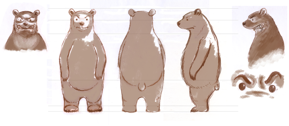
Also when designing a character draw them lots in different positions, angles, poses as this will help to create them from the front, the sides, from behind etc. whether your character is human, animal, a creature or even an object. Think about the lines you use for instance;


Here are some images of her work showing the different angles and positions of characters she has created;


Bear Concept Layers

Throughout her work she uses media such as Acrylic, Gouche and Pencil sketches.  
Inventor Animal 1
Inventor Animal 2
Emma Reynolds also talked through what to do when creating a picture book which is 32 pages long.She advised us to start with an idea, a script, a story maybe have a funny situation think of what characters would best suit these situations it could be a meaningful doodle you have done. During picture books there is minimal text as text is for dialogue and main events. The pictures do the describing as you could have characters doing one thing and the text saying another.

''Pictures tell the story!''  - Emma Reynolds


Emma Reynolds Influences!

Raymond Briggs


I love his work, his images of the snowman bring back lovely memories of my childhood when I was watching the film with my Grandma, makes me feel all warm and fuzzy inside. 

Raymond Briggs was born on Jan 18th 1934, he shares a birthday with Alan Alexander Milne who is well known for his stories on 'Winnie the pooh'. 
Briggs is a children's writer and an illustrator who gained most his inspiration from his parents, his father was a milkman and his mother was a lady's maid. He started illustrating when he left school in 1957 and his first Children's book he published was called 'The strange house' in 1961. 

Furthermore I found in an interview with Raymond Briggs his answer to becoming a successful illustrator in which he replied; 

''Learn to draw, learn to paint, don't fiddle about on computers, they are a useful tool, when you know what you are doing, but they can make you feel clever when you are not.'' 

Leaving you fresh with this quote in mind!


Thursday, 19 December 2013

Portfolio 2 with Anna Violet

Anna Violet is a freelance illustrator based in Chorlton, Manchester. She illustrates children's books, book covers, portraits, decorative maps and local scenes. Her clients are national trust, Carus publishing and Oxford university press.

Her work explores the method of ink, pencil and vibrant colours I feel are watercolour. Her images are unique representing the innocence throughout her characters capturing that playful instinct during her progression of work.

Here are some examples of her work;
Aesops Fables - The fox, the crow and the cheese

Jungle Book tiger prowl

This is my favourite image that she has produced of a fox that was published in AOI images 34 annual 2010

Blackbird -published in Spider magazine April 2013 as one of four illustrations for a short story the blackbird and the worm.(S.Krensky)
I find Anna Violets work very inspirational, I especially love the pose she creates throughout the animals portrayed.
I thought I would send her my portfolio , in hope she would advise me on how to improve it and make it better, in which she kindly did.

Anna Violet explains her main experience is on local scenes and children's book illustrations, so this will be the main angle in which she responds to my images. She expresses the point of being subjective and how her favourite mediums are ink and pencil, so has a downer on other mediums. This worried me slightly as I work with the method of collage and thought Anna Violet wouldn't be interested, however she proved me wrong and gave me some brilliant advice.

 She first starts off by telling me that she loves the handmade-look I have created throughout my backgrounds and paint marks and my lively childlike/naive compositions. The transparency, colours and boldness of Visual world invent works well. Especially as she expresses that she is a sucker for black backgrounds too. Although she wasn't sure what my image was trying to say.
 Her favourite image throughout my portfolio is the composition of Grandad Bink in the Boat, Violet found the energy of the water marks and the effect of torn paper is very effective, especially the way my character is tucked-up in the boat this makes everything seem part of the sea.
She then asks me a question if I've been influenced by an artist called Alfred Wallis, in which I wasn't as I've never heard of him before my influence for this image was found objects of boats I found around my home and artists working with monsters and exploring innocence and fear in an indicative playful state for example; Sara Fanelli, Judith Kerr, Picasso and Klee.

However when I researched Alfred Wallis I could clearly see the connections of my boat compared to his creations exploring different styles of boats gushing along the ocean. Here are some examples of his work;


 Furthermore, My wind in the willows characters looked intriguing she thought I had great lettering too. She liked the soft muted palette and ink work but isn't sure this would appeal to the children's book market. Wondering if the cloth textures need to be more integrated. She suggests I should desaturate the whole of my Badger character and add colours that go across different mediums. Or maybe using a different fabric that fits with badger, thinking about the black and white stripes that badgers have. Violet responds to my wind in the willows characters in needing to be more childlike (no moustache, bigger heads etc.) showing obvious emotions/body language so the reader and child can empathise with.

More over Anna Violet expresses she is confused with the chair represented throughout my image of Baby Bink however likes the use of thread with the painted background suggesting to make it clearer on a bigger image. Then swiftly moving on to my Nana Bink on the phone image which Anna Violet feels the textures and line works well giving off a scary effect. This is great I'm glad my Bink Character made an impression although Nana Bink is meant to look worried so will improve this emotion by adding her worried wrinkles to make a better expression that hopefully gets her emotion across to the reader and various audiences.

Violets comments are great which I will defiantly take on board throughout my own practise and portfolio.

Ending with the point that she is looking forward to seeing my work at the show next spring!

Sunday, 15 December 2013

Portfolio review by Rosie Wilman

My Mentor Rosie Wilman gave me a lot of great advice in presenting my portfolio to be more professional, by considering the space I use for my image making sure it is central and there are no shadowing lines at the sides that will intervene with the presentation of my image. Rosie feels the way I have recorded my Pdf portfolio is working well, showing the progression between projects. She has suggested that it would be nice to have a page that shows my working method, representing how I go from a sketch to the finished thing or how I've developed that idea.

Here a few examples of what she means;


Looking At these two examples she has produced I now understand a lot better the point she is trying to get across and I am willing to try this throughout my own portfolio showing my own progression throughout my work. I didn't realize that this would be an interesting factor to represent during my portfolio. 

Rosie has also suggested to include some of my tree family people in my portfolio as she thinks there ace. Expressing the point to always keep adding to it, improving my work making sure I am able to talk confidently about each piece so that I am ready for portfolio visits.

She was also very helpful in guiding me throughout my critical Journal that I am writing alongside my practical work, reflecting on my processes that I come across. As I am struggling to put it all together in a way it makes sense academically linking quotes and chapters together as well as my reflection of my own work.
I am trying to receive as much help as I can,  Rosie was a big help she has given  me a few key artists/thinkers to look at. Such as, Mark Rothko and his idea of 'colour theory' linking this to my own practise in the way I use muted backgrounds throughout my images so the characters in front of the background stand out. Using bright colours for example I have used red and yellow throughout one of my images that I have created of 'Grandad Binks Boat'.

Here are some examples of Mark Rothko's work;

Muted Blue's


This is Mark Rothko in front of one of his muted images in black and white.

Muted Red's


And here are a couple of my own images representing mute backgrounds contrasting with the image in front; 
Baby Bink Hiding behind a chair as she's scared and frightened.

Worried Nana Bink on the phone.


Tuesday, 26 November 2013

Lecture with Rick Frankland - Dwelle - Thinking a little differently!


Throughout this lecture I learnt about the construction industry and what Rick Frankland has achieved throughout his career.

Rick Frankland is an architect as well as an Eco - building manufacturer urban designer for Dwelle, building house extensions and other things. Frankland has done lighting exhibits and lots of talks for a while to make money and a living.

Rick's Job in Dwelle is dabbling with images that create a house that's got big space, is modern and is eco-friendly. Whilst thinking about different materials that would be suitable to use to create these houses such as timber or oak for the frame of the building. Making the house highly insulated, giving it air - tight ventilation, plenty of light with solar shading and can re-cooperate renewal energy.

Rick and his team were on 'Grand designs Live' in 2009 and they had to represent this idea throughout a prototype of a house made out of wood like a shed. He won awards for this particular shed design and had received lots of interest for their new micro-building designs. However during the course of their development in the construction industry they came across a lot of problems' such as having no money and having to try to come up with solutions to make some. As they were going through some difficult times and still are now. They also came across many issues in making the building for instance, when cutting pieces of wood, they were cutting them too short as they got the measurements wrong and the gutters wouldn't fit because they were too short as well . The Dwelle team also found that when building the shed design inside the exhibition area things weren't working out. The construction of the prototype wasn't completely finished in time because there was a big digger in the way where they had to construct the design.

Here are some images;

A cut - away of the ModCell structure, showing timber frame and packed straw.
This is what the inside looks like of the prototype.
This is what the shed design would look like built outside 
At this moment in time of his career he is in the middle of producing a mobile home, using the three R's in producing an eco- sustainable home.
The three R's are; Reduce, Reuse, Recycle and as a fourth maybe even Refuse. 


Here are some images of prefabricated mobile homes designed by dwelle.ing creating a much larger space for holiday homes. Which will provide a living room, a dining room and three bedrooms.


Furthermore, this year Dwelle have developed a high-tech modular housing solution for Grand designs live 2013 which has been talked about on BDE Podcast - buildings design expert.


 Here is a link to there page ; podcast-grand-designs-live-2013 which explains in more detail about this event.

Throughout the lecture the most important piece of advice Rick Frankland gave, when working with people as a team and in general is to always listen!

To finish with this quote that inspires Frankland throughout his progression of his career which helps him give a bit of a boost; 

By Confucious - I hear and I forget,
                          I see and I remember,
                          I do and I understand.

Monday, 1 July 2013

OWT Creative

OWT Creative - The Notions Of Success, Failure and Inspiration!

Discourse/Pub Chat - Monday 1st July 2013 
Manchester
Deaf Institute

The first in a series of talks from emergent and established practitioners with Malcolm Garrett, Craig Oldham and David Bailey.

I was very excited for this event to happen as I've never been to one before. It was held at the 'Deaf Institute' restaurant in Manchester. I've never been to this place before so was really excited to see what this building was like and what it looked liked inside.
I went with my boyfriend as I didn't want to go alone and it was a great surprise to see one of my tutors there and a friendly women from college. After we sat down and got a drink the event started.
It was a great experience!

First to talk was a practitioner called David Bailey he is a photographer became a photographic assistant at the John French studio, then photographer for John Coles studio five before being contracted as a fashion photographer for British Vogue magazine in 1960. 

Here is David Bailey; 


He spoke about how you cant have perfection without imperfection as imperfection is our life's design.
 He also talked about how he worked for designers republic in Sheffield and its good to make mistakes and to think about scale when you work and to be ambiguous.
I thought he also gave a great piece of advice to;

Quote -  'Don't go straight to a computer, especially when answering a brief - Use Your Brain!'

David also spoke about whether design is important?
Persian rug-makers made imperfections so they didn't offend God. Perfection may not be a good thing. If everything is perfect, what else is left to do?

I asked my boyfriend what he thought of this coming from a scientists perspective he said this links to 'Entropy'. Entropy is the measure of disorder of a system. The universe likes things to be disordered an this is a lower energy state.
I didn't quite understand what this meant so he gave me a simple entropic example:
Imagine if you had 3 balls, all red; the only way could arrange them is: RRR (there is only one arrangement)
If you paint one blue, then the possible arrangements are; RRB, RBR,BRR (now there is three different arrangements)
If we paint another red ball, but make it green, then we can have: RBG, RGB, BRG, BGR, GRB, GBR (now there is six different arrangements of the balls)
We can arrange the three colours in six ways, this is far more favourable, so would be a low energy state.
To move something from a disorder to an ordered state, you have to give it energy. Energy can not be created or destroyed, only converted and transferred. Therefore in order to give something energy, you must take it from somewhere (or yourself).
If you don't have energy, it leaves you either depressed or working like a robot automaton. I took this in the way that a high energy state leaves everyone with no energy leading to 'robot mondrony' and depression. I thought this was a very interesting view. 

we then had break and the second person came on the small stage to speak about the topic of Failure.
He was quite funny and he swore a lot and he said right at the beginning this is just who I am so if you don't like it then this talk isn't for you. 
He is called Craig Oldham he is a British designer based in the UK. Oldham has produced design work in design, film, tv art, retail, sports, entertainment and education.

Here is an image of Craig Oldham; 


He wore bright red pants so from the duration of his talk people kept getting distracted by them and suggesting funny comments like his pants choice was a total failure.
He spoke about not to be afraid of failure and to embrace it don't be scared of it. 
Be open minded and take risks!

Quote; ' Doubt is better than certainty'

He also gave four good steps to when your designing/working etc and they are;

  • Be experimental - explore
  • Do lots of research/ take risks
  • Be original and unconventional
  • Try to think of the Alternative
He said that appropriate experimentalism is good, fun, interesting and exciting, but it might lead to failure.
Don't be different for difference sake, be different to make original and innovative choices.

I asked my boyfriend what his view on this discussion was and he gave me a great question/statement that really gets you thinking; 
     'If there was no failure; how could we appreciate Success?' 
which I thought was a great rhetorical question that gets your mind wondering.

Furthermore we then had another break and they saved the best to last. 
Malcolm Garrett a British graphic designer has worked for music artists which he's most recognized for producing the front covers of albums for musicians such as 'Simple Minds', 'Duran Duran', 'the Buzzcocks' 'magazine' and 'Peter Gabriel'. He was an early convert to exploring the opportunities and challenges of design with digital technology and his London studio was the first amongst its peers to go totally digital in 1990.

This is Malcolm Garrett; 


His topic was to speak about inspiration, however throughout his talk he touched upon all three topics of success, failure and inspiration.
Malcolm spoke about many things, he mentions how inspiration comes from anywhere and everywhere, Malcolm's inspiration comes from many things for instance; at the time when he was growing up 'Thunderbirds' was the big thing and when he watches them it reminds him of good times and memories, this is what inspires him.

He also mentioned that one of his inspirations is pop art with 'Andy Warhol's' images of Marilyn Monroe with the repetition of colours that are bright, vivid and colourful. He also loves the idea of 'pop art influencing the art of pop'. Which was then placed in an art movement like Post-Modernism and Dada. 
Especially as now his work is not only symbolic but iconic. For example the album cover he created for the Buzzcock's 'Orgasm Addict' it was simple yet it gave meaning to the album.
The women he worked with whom designed the collage on the front is called 'Lynder' and without who input the cover wouldn't be great.

Here is an image of the Buzzcocks front cover; 


Malcolm said; 'If you can draw icons with its graphics its Iconic.'             also

                     'Whatever inspires you changes your culture.'

I think these are two great quotes that a quite spine-tingling and inspirational. 

when working for a client, you cant do great work for them that they don't won't as their a partnership! so, 'Keep it Modern, Keep it Bold.'
Success is a double-edged sword, new ideas and technology do not replace old ones, they are simply their to provide new opportunities and directions to move in.
To  help move forward!

In conclusion, it was a fantastic experience, I had a lot of fun especially as it was very interesting and I can't believe I saw Malcolm Garrett he's so cool. I enjoyed learning something new and taking away with me some great pieces of advice!
Throughout my projects there are bound to be ups and downs, success, failures, success ,failures and lots of inspiration but that's life.
So if your struggling with something as Malcolm Garrett says; 

Quote; 'Go backwards and find the problem and see if you can solve it!'