Tuesday, 26 November 2013

Lecture with Rick Frankland - Dwelle - Thinking a little differently!


Throughout this lecture I learnt about the construction industry and what Rick Frankland has achieved throughout his career.

Rick Frankland is an architect as well as an Eco - building manufacturer urban designer for Dwelle, building house extensions and other things. Frankland has done lighting exhibits and lots of talks for a while to make money and a living.

Rick's Job in Dwelle is dabbling with images that create a house that's got big space, is modern and is eco-friendly. Whilst thinking about different materials that would be suitable to use to create these houses such as timber or oak for the frame of the building. Making the house highly insulated, giving it air - tight ventilation, plenty of light with solar shading and can re-cooperate renewal energy.

Rick and his team were on 'Grand designs Live' in 2009 and they had to represent this idea throughout a prototype of a house made out of wood like a shed. He won awards for this particular shed design and had received lots of interest for their new micro-building designs. However during the course of their development in the construction industry they came across a lot of problems' such as having no money and having to try to come up with solutions to make some. As they were going through some difficult times and still are now. They also came across many issues in making the building for instance, when cutting pieces of wood, they were cutting them too short as they got the measurements wrong and the gutters wouldn't fit because they were too short as well . The Dwelle team also found that when building the shed design inside the exhibition area things weren't working out. The construction of the prototype wasn't completely finished in time because there was a big digger in the way where they had to construct the design.

Here are some images;

A cut - away of the ModCell structure, showing timber frame and packed straw.
This is what the inside looks like of the prototype.
This is what the shed design would look like built outside 
At this moment in time of his career he is in the middle of producing a mobile home, using the three R's in producing an eco- sustainable home.
The three R's are; Reduce, Reuse, Recycle and as a fourth maybe even Refuse. 


Here are some images of prefabricated mobile homes designed by dwelle.ing creating a much larger space for holiday homes. Which will provide a living room, a dining room and three bedrooms.


Furthermore, this year Dwelle have developed a high-tech modular housing solution for Grand designs live 2013 which has been talked about on BDE Podcast - buildings design expert.


 Here is a link to there page ; podcast-grand-designs-live-2013 which explains in more detail about this event.

Throughout the lecture the most important piece of advice Rick Frankland gave, when working with people as a team and in general is to always listen!

To finish with this quote that inspires Frankland throughout his progression of his career which helps him give a bit of a boost; 

By Confucious - I hear and I forget,
                          I see and I remember,
                          I do and I understand.

Self - Directed Project

This is progression of a project I started in the summer on scary stories, here are images of my work from my sketch book of processes I have been using which I will compose together to create an image that will reflect more sophistication and a more of an complete illustration for my book on 'The Bink Family'. A story which I have created with monsters that live in teepees in a village called 'Porkstock'. 
I am aiming to produce a children's book for ages 5-7 years old, representing events that might happen in real life that children and there families may come across, I am hoping children will relate to some of the feelings represented throughout the story and will hopefully help them cope with any anxieties they may start to have. For example; feeling scared and lonely as if they are always doing something wrong and don't want to upset there parents or make them angry.   
A lot of these theories are reflected and touched upon throughout my Journal which is a reflection of my own practise as well as investigating, psychologists, artists and theorists. 

Ink marks


Collages

Baby Bink's teddy bear

Teepee


More ink marks

Baby Bink


A collage for a landscape


Bink Character


Painted flowers 


Collage of a tree


A mixture of collage, ink and paint creating a landscape


Ink sketch of a tree

Exploring an ink sketch of nasty Tree monster bashing Grandad Bink on the head thinking about the expressions to use to get the feelings across that he is getting hurt. 

Collage of Grandad Bink

Collage of another Teepee


collage of a Bink chair


and a Bink Table


Nana and Grandad Binks Boat 


Police Boat in process


Here is a composition I am in the process of setting the scene on what the village of Porkstock will look like!


My aim is to create four double page spreads for my story, with a story board and mock up book.

Friday, 22 November 2013

Steve Byram

Steve Byram is a fine artist and a professional commercial artist which I have been exploring to widen my knowledge and understanding of the incredible use of Line that he uses throughout his compositions giving them more sophistication, this is what I am hoping to achieve throughout my own practise thinking about the weight and pressure I use when using a pencil or pen when creating a line.

Here a few examples of his work;


This Image is spine-tingling with the use of marks represented gives his character more of an edge, I have been creating rubbings of inanimate objects to create this same essence throughout my work. 

Here are a few images of My Own Work of rubbings I have made then producing them into something new;

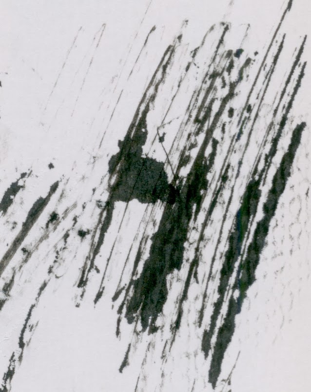
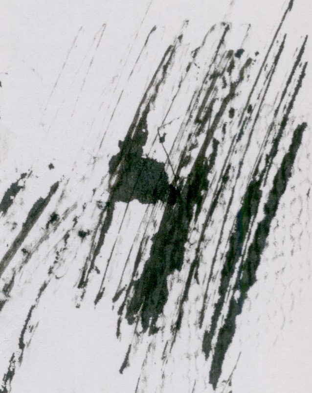
These are Ink scratchings that i created using a wooden stick. 
(can also use like a tooth pick for finer lines)


This is a rubbing using charcoal smudging and using the side of it to create variant lines in this case I used my material to produce a texture for a fence.


Here are a few of my own images consisting of line and mark making.

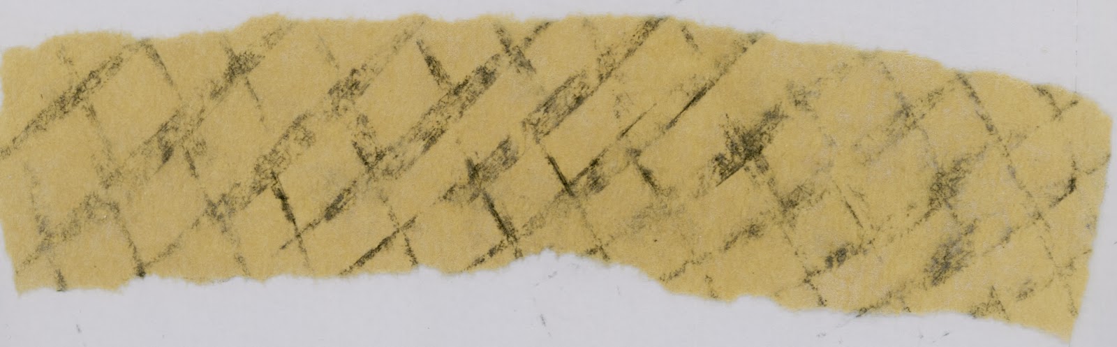
This rubbing was created with the use charcoal making a rubbing of textures I found on a wall that I thought looked quite effective.  

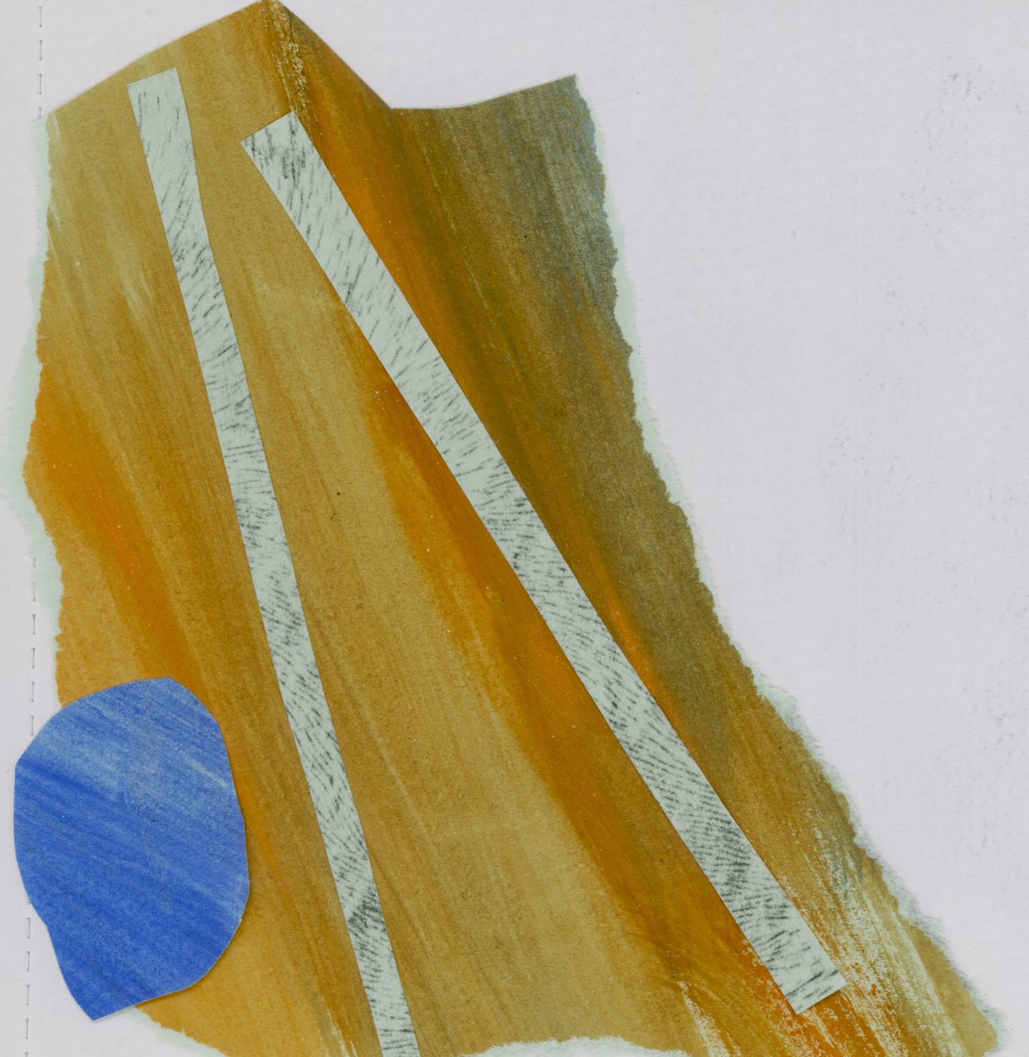
And this image is a Background I created which I can use in various images which create a more subtle essence bringing other characters together that are in front of the background.

Materials I used to produce this are vintage papers and Gouache paints throughout the process of collage which was then painted over the top with white emulsion. 


Here Is an image from a website representing Steve Byram


Here is the web link:  Screw Gun Records

What is keeping me Motivated!

Andy Goldsworthy

This is an Artist suggested by my seven year old sister she told me that she was learning about him in school she said he does lots of models and she told me she saw a clip of him producing an art piece called a rain pattern. I was very impressed with the excitement she had telling me about this artist and the fact she had learnt someone new that I had never heard before. Its fantastic the things you can learn off little children.

This is a picture of Andy Goldsworthy Himself,


Andy Goldsworthy is a British sculpture photographer, environmentalist and land artist. The materials Andy uses are mostly nature based for instance his works of art consists of leaves, mud, snow, pine cones,stones, twigs, brightly coloured flowers, icicles,thorns and lots lots more. 


This is the picture my sister was so excited about called the rain picture, this is where Andy lay on the floor whilst it rained then when the rained had stopped he had moved to find a dry shape of the outline of his body on the ground. Its Amazing who would of ever of thought of doing that.


His sculptures are rather quite interesting I especially enjoy these two sculptures based around trees and the forest this gives me good reference related to my project brief on Scary Stories, related to my Tree monsters.

Thursday, 17 October 2013

Episode 33 - Art Director Stephanie Glaros

Thomas James talks to Stephanie Glaros of Utne Reader Magazine about how she became an art director going in depth. I listened to this interview throughout a pod cast and found the discussion very alluring learning about someone else's experience's in the industry.

Here are notes I made from listening to the podcast;

I found out that it was the 25th anniversary over a year ago of the magazine of Utne with 1500 publications, zines, journals etc. and they pick the best of the best to put in the mag.
Stephanie Glaros did some freelancing and she never had a clear path in her life. She got a Batchelor's degree in women's studies when she was in her mid-20s and she was thinking about being in politics. Unfortunately, this did not happen, but she is happy that she has experience. She was a waitress for almost a year, she travelled, learning more about her country, getting different perspectives. Co-operating with the environment, working in marketing, learning about photoshop and illustrator and then went on to become a graphic designer. This is when she went back to school and then became a freelancer.

Here is a picture of Stephanie Glaros:

At one point, she was sat on a bench, looking at logos when a woman from Utne magazine walked past and started to ask questions about the work Stephanie was doing. The woman seemed very interested in Stephanie's work, so took her off to see the manager of Utne magazine. This was Stephanie's first contact with the magazine. She later emailed the company asking if there was any work going. A woman took a chance on Stephanie, hiring her, despite Stephanie not knowing how things worked, the reason behind this was that the woman saw Stephanie's passion for the work.

While Stephanie met a freelancer called Wayne Wolf, who taught her how to do publications and that is how Stephanie learned how to do art directing. She had to learn most of this on her own as there is very little communication between art directors. She feels like this 'trial and error' method is unfair and that there should be some sort of job training to help someone to become an art director. She started to communicate via email, looking for the right person, receiving sketches, talking to editors and the more she did this process, the more she got the hang of it and feels like she has grown with the magazine, finding her voice and visual preferences.

Illustrators are doing very well in finding their own resources and feedback for their sketches. Stephanie likes to get connected to other art directors, the more you talk to others, the more you learn about each other, because there is less of us out there, it is a competition to get some jobs. This is odd because illustrators are doing the same thing. She is always looking for interviews with other art directors, trying to get more involved, asking questions and emailing people.

It would benefit us all more if we were all talking to each other about the mistakes we have made, what works for individuals and what doesn't. Pieces of advice from Stephanie are:

  • Don't be afraid of being in control
  • Trust your own judgement
  • Let the editor/artist gain control
Stephanie found that she sometimes had trouble having faith in herself, so she often takes time to figure out things, the answers may not be found in a book. She also had to make sure that people were not walking all over her, standing up for herself and he own work. She took a year out for herself, to take control and express her own vision, working out how to sort out her life and organising things. Throughout her work, she likes white spaces and not a lot of colour. She likes to have concrete solid ideas of what to do. She needed to find her own process to get things together for the magazine, to get out of the door. She read and looked upon a lot of other magazines, to help her and she was identified more as an art director and a photographer, but not so much as a graphic designer. She likes her own aesthetics as simple, not making the magazine too cramped and making use of white space. Her library of publications is very niche, trying to keep a balance between photographs and illustrations.

She likes documentaries and a wide range of subject matter, she deals a lot with ideas and this is where illustration is used. Throughout personal narratives, she likes conceptional thinkers and she hires two-three people, always looking for new illustrators as she likes a solid group of people working on a regular basis, allowing her to work with all types of different people on the spectrum, which she finds most fun, such as:
  • screen printers
  • graphic novelists
  • children's illustrators
Creating a monthly magazine takes a lot of planning and pitching and meeting up, getting involved from the beginning. She is always informed, she makes samples of illustrators, then gets together with the editor to talk about her ideas and artists she has looked at. When she decides who to have, she will contact them by email and sometimes with a phone call. She will send the artist a timeline, a budget and gives them 3-4 days for sketches and then around a week for a final design, giving them a push in the right direction as some of the content they print is quite heavy, so she feels her job is to sometimes help illustrators break it down to understand what it is about and what they want. When writing an email, she has to choose her words carefully, to try and help nudge them on the right path.

Some of the fun things about her job include seeing the final design from illustrators. She likes illustrators to send sketches in monochrome because sometimes the sketches colour palette isn't right. She expects illustrators work should be predictable, but sometimes she is surprised by the work that she receives and this can be a double-edged sword, with some work being better than expected, but other work not being up to scratch.

With editorial illustration you need a consistent style, advertising can work with a lot of styles as they work with art reps and don't need a middle man between the art director and the artists they are able to directly communicate. A cover of a magazine is like an advert for what is inside, which needs lots of approvals. Throughout this process, there are a lot of restrictions, for instance you have to think about where the logos go, do things have to be vertical etc. Type in illustration is not used very often as the text is heavy already and there is no space for type. They like straightforward consistent typographies.

Stephanie finds new illustrators by letting them contact her as she likes to feel special and have a bit of an ego. She prefers it when they show familiarity with the magazine as that goes a long way with her and showing that they have initiative in contacting the right person and researching in what they do. Stephanie prefers it when she is able to easily find what someone does through sites such as illustrationmundo, where their work is front and centre on the blog, for people to see easily. She is also happy to receive personalised postcards from prospective illustrators with their contact details and she freely gives feedback.

In the future she is hoping to continue her work, refining her process, learning something new every project or job. She feels that she is in a good place at the moment and really wants other art directors to share resources, struggles and successes as this would benefit the art community as a whole. The key factor is Stephanie's eyes for advancing is communication, if everybody communicates more, then they would be able to share experiences and everyone could learn.

Thursday, 3 October 2013

The Bink Family!

I went on an outing with my family one day and I was sat at a table just daydreaming and doodling when I came up with this monster family that I randomly called the 'Binks'.

I started to draw them more and created a collage composition for each character giving each one a  personality and characteristic. Which then led me to thinking what if a made this family of monsters into the basis of my scary story and thats exactly what I did.

Here are some images showing the progress of my thought process;

My first Doodle/idea of the Bink Family!

Sketch of what baby bink might look like!


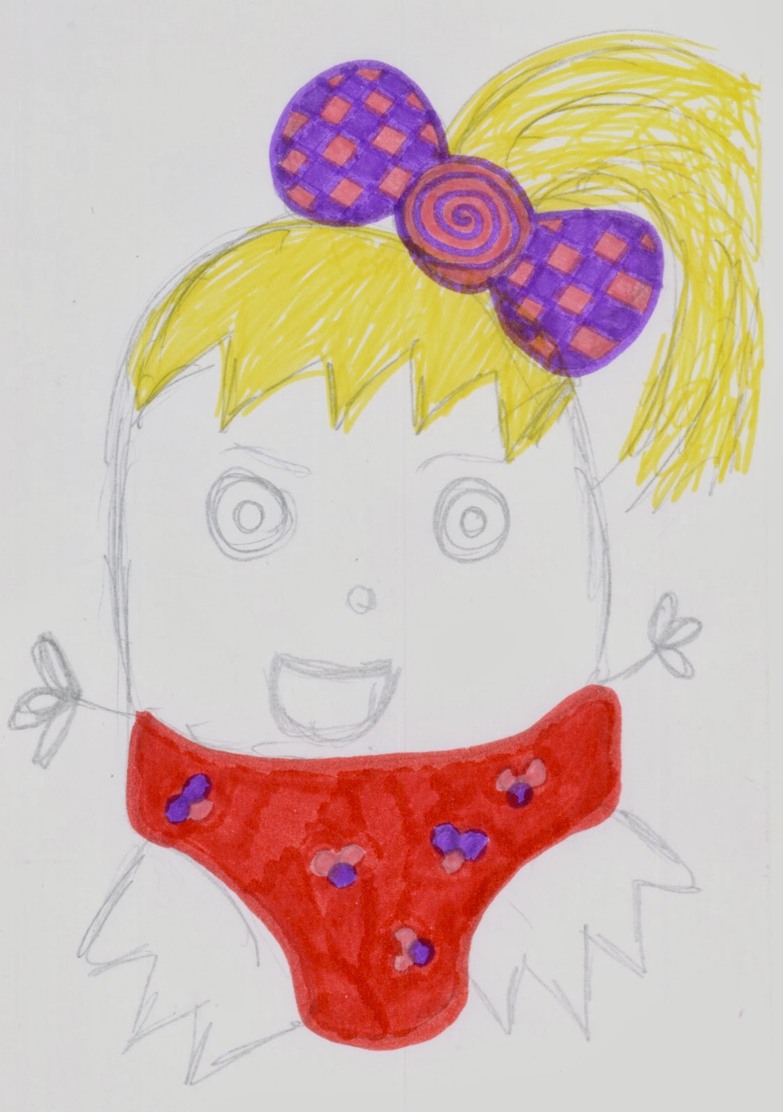
Lola Bink

Baby Bink with her teddy bear

Daddy Bink

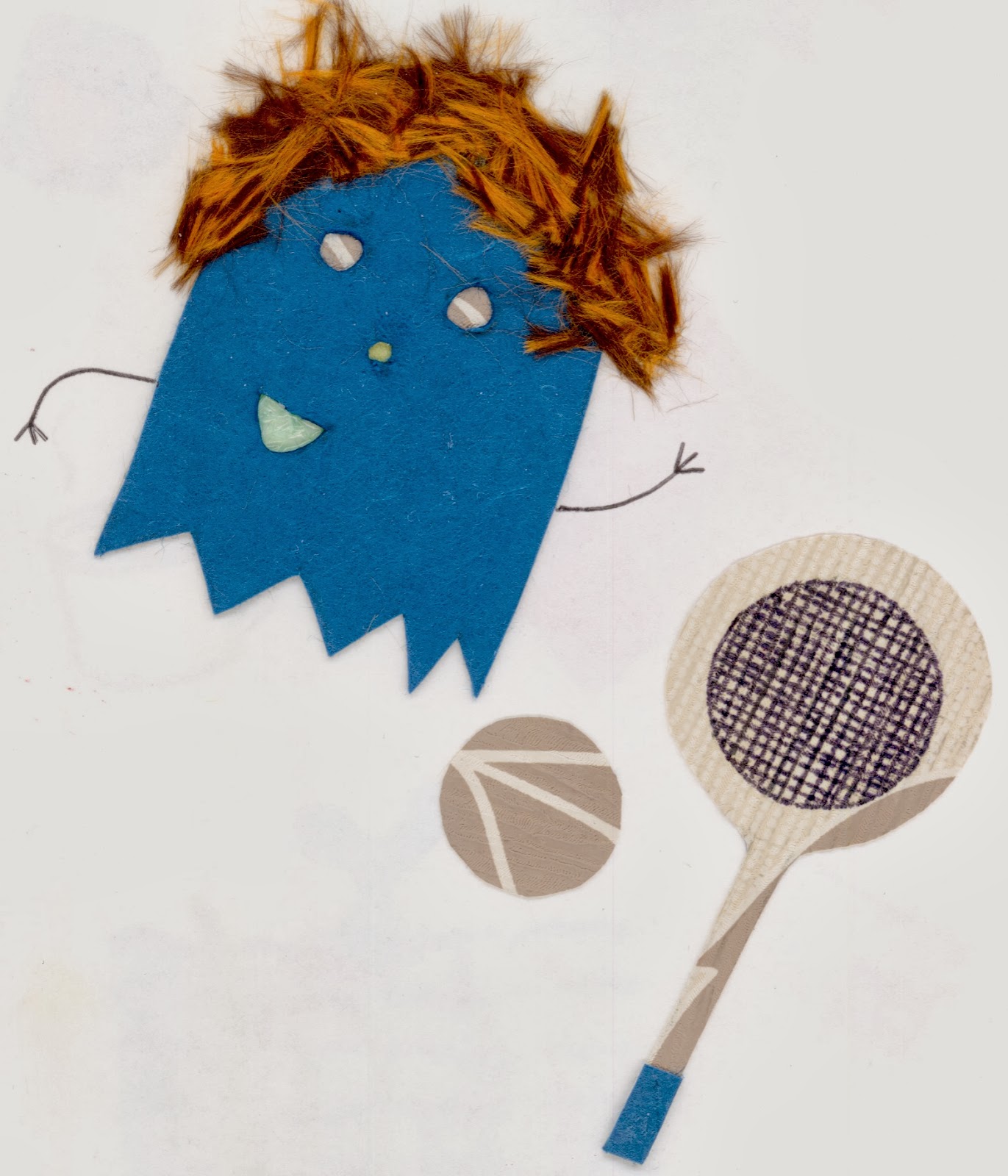
Geoffrey Bink with his tennis racket

Water colour Teepee that the Bink family live in near a river

I then came up with a story for my family, aiming at children ages 5 - 8 years of age. However I need a scary character/s that will make my story more interesting trying to represent fear and darkness within my work however not to scary as I don't wont to frighten children that much.

Here are some compositions I have created exploring the technique of ion printing to give my scary tree monster more of an edge as well as my work looking more sophisticated.

Original Sketch of the Tree monster

Collage of female tree monster

Collage of Male tree monster

Experimenting with Lino printing to give my character more of an edge.