I have investigated a variety of websites in which I will list some attributes and functionality for what I would like my own website to have.
Advantages
I have looked at Sara Fanellie's website which I found is set up differently to any other website I have seen before. I like the layout in which, it shows key titles on the page convincing her audience to want to explore more by clicking onto one of them. Which takes you to a list or link to showing her work that she has produced for books or her portfolio. This also makes her website tidy and organised not leaving it in such a chaos that the audience cant concentrate on the key elements, making it easier to take in the information. I also find this layout simple yet vintage.
Here is a link to her website: Sara Fanelli
Another artist's website I wish to add the key features and explore the layout she has used throughout my own website is a freelance illustrator Anna Violet. I found the way she has layout her website is very effective throughout the vibrant colours represented throughout her name which stands out on the black background giving it a sense of sophistication.
Here is a link to her website: Anna Violet
Another website I thought was quite intriguing is by an artist called Gemma Correl I love the first page to her website its playful and unique in its own style.
Here is a link to her website: Gemma Correll
Disadvantages
Artist Megan Lara has created a very eye-catching website that does make you want to explore her work more, however I find it hard to find information of who she is and how to contact her which could be improved throughout her website very easily if she so wished, as this is her only downfall.
Here is a link to her website: Megan Lara
Another artist I have come across is of a designer called Joshua Ariza, I find his website very plain and could be represented better with the use of more imagery and trying to not put too much information that portrayed on all the same page. I find his slogan great as I am reeled in to know more. But am slightly confused as to where I should start to look to find out more of his work.
Here is a link to his website: Joshua Ariza
Overall I hope to produce a good website that gets audiences a spine-tingling feeling in wanting to explore my world of inventive play throughout my work. Hoping to represent myself in a sophisticated professional fashion.
Thursday, 19 December 2013
Portfolio 2 with Anna Violet
Anna Violet is a freelance illustrator based in Chorlton, Manchester. She illustrates children's books, book covers, portraits, decorative maps and local scenes. Her clients are national trust, Carus publishing and Oxford university press.
Her work explores the method of ink, pencil and vibrant colours I feel are watercolour. Her images are unique representing the innocence throughout her characters capturing that playful instinct during her progression of work.
Here are some examples of her work;
I find Anna Violets work very inspirational, I especially love the pose she creates throughout the animals portrayed.
I thought I would send her my portfolio , in hope she would advise me on how to improve it and make it better, in which she kindly did.
Anna Violet explains her main experience is on local scenes and children's book illustrations, so this will be the main angle in which she responds to my images. She expresses the point of being subjective and how her favourite mediums are ink and pencil, so has a downer on other mediums. This worried me slightly as I work with the method of collage and thought Anna Violet wouldn't be interested, however she proved me wrong and gave me some brilliant advice.
She first starts off by telling me that she loves the handmade-look I have created throughout my backgrounds and paint marks and my lively childlike/naive compositions. The transparency, colours and boldness of Visual world invent works well. Especially as she expresses that she is a sucker for black backgrounds too. Although she wasn't sure what my image was trying to say.
Her favourite image throughout my portfolio is the composition of Grandad Bink in the Boat, Violet found the energy of the water marks and the effect of torn paper is very effective, especially the way my character is tucked-up in the boat this makes everything seem part of the sea.
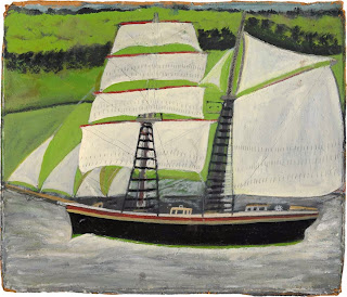
She then asks me a question if I've been influenced by an artist called Alfred Wallis, in which I wasn't as I've never heard of him before my influence for this image was found objects of boats I found around my home and artists working with monsters and exploring innocence and fear in an indicative playful state for example; Sara Fanelli, Judith Kerr, Picasso and Klee.
However when I researched Alfred Wallis I could clearly see the connections of my boat compared to his creations exploring different styles of boats gushing along the ocean. Here are some examples of his work;
Furthermore, My wind in the willows characters looked intriguing she thought I had great lettering too. She liked the soft muted palette and ink work but isn't sure this would appeal to the children's book market. Wondering if the cloth textures need to be more integrated. She suggests I should desaturate the whole of my Badger character and add colours that go across different mediums. Or maybe using a different fabric that fits with badger, thinking about the black and white stripes that badgers have. Violet responds to my wind in the willows characters in needing to be more childlike (no moustache, bigger heads etc.) showing obvious emotions/body language so the reader and child can empathise with.
More over Anna Violet expresses she is confused with the chair represented throughout my image of Baby Bink however likes the use of thread with the painted background suggesting to make it clearer on a bigger image. Then swiftly moving on to my Nana Bink on the phone image which Anna Violet feels the textures and line works well giving off a scary effect. This is great I'm glad my Bink Character made an impression although Nana Bink is meant to look worried so will improve this emotion by adding her worried wrinkles to make a better expression that hopefully gets her emotion across to the reader and various audiences.
Violets comments are great which I will defiantly take on board throughout my own practise and portfolio.
Ending with the point that she is looking forward to seeing my work at the show next spring!
Her work explores the method of ink, pencil and vibrant colours I feel are watercolour. Her images are unique representing the innocence throughout her characters capturing that playful instinct during her progression of work.
Here are some examples of her work;
 |
| Aesops Fables - The fox, the crow and the cheese |
.png) |
| Jungle Book tiger prowl |
.png) |
| This is my favourite image that she has produced of a fox that was published in AOI images 34 annual 2010 |
.png) |
| Blackbird -published in Spider magazine April 2013 as one of four illustrations for a short story the blackbird and the worm.(S.Krensky) |
I thought I would send her my portfolio , in hope she would advise me on how to improve it and make it better, in which she kindly did.
Anna Violet explains her main experience is on local scenes and children's book illustrations, so this will be the main angle in which she responds to my images. She expresses the point of being subjective and how her favourite mediums are ink and pencil, so has a downer on other mediums. This worried me slightly as I work with the method of collage and thought Anna Violet wouldn't be interested, however she proved me wrong and gave me some brilliant advice.
She first starts off by telling me that she loves the handmade-look I have created throughout my backgrounds and paint marks and my lively childlike/naive compositions. The transparency, colours and boldness of Visual world invent works well. Especially as she expresses that she is a sucker for black backgrounds too. Although she wasn't sure what my image was trying to say.
Her favourite image throughout my portfolio is the composition of Grandad Bink in the Boat, Violet found the energy of the water marks and the effect of torn paper is very effective, especially the way my character is tucked-up in the boat this makes everything seem part of the sea.
She then asks me a question if I've been influenced by an artist called Alfred Wallis, in which I wasn't as I've never heard of him before my influence for this image was found objects of boats I found around my home and artists working with monsters and exploring innocence and fear in an indicative playful state for example; Sara Fanelli, Judith Kerr, Picasso and Klee.
However when I researched Alfred Wallis I could clearly see the connections of my boat compared to his creations exploring different styles of boats gushing along the ocean. Here are some examples of his work;
Furthermore, My wind in the willows characters looked intriguing she thought I had great lettering too. She liked the soft muted palette and ink work but isn't sure this would appeal to the children's book market. Wondering if the cloth textures need to be more integrated. She suggests I should desaturate the whole of my Badger character and add colours that go across different mediums. Or maybe using a different fabric that fits with badger, thinking about the black and white stripes that badgers have. Violet responds to my wind in the willows characters in needing to be more childlike (no moustache, bigger heads etc.) showing obvious emotions/body language so the reader and child can empathise with.
More over Anna Violet expresses she is confused with the chair represented throughout my image of Baby Bink however likes the use of thread with the painted background suggesting to make it clearer on a bigger image. Then swiftly moving on to my Nana Bink on the phone image which Anna Violet feels the textures and line works well giving off a scary effect. This is great I'm glad my Bink Character made an impression although Nana Bink is meant to look worried so will improve this emotion by adding her worried wrinkles to make a better expression that hopefully gets her emotion across to the reader and various audiences.
Violets comments are great which I will defiantly take on board throughout my own practise and portfolio.
Ending with the point that she is looking forward to seeing my work at the show next spring!
Monday, 16 December 2013
Zak Doodle
Zak doodle is a children's illustrator from Greece, I love her work the compositions she creates are very sophisticated, especially with the use of line that is represented exploring the weight and heaviness of the line produced by ink or pencil. Bringing that child innocence and naive essence together, as when we get older we tend to lose this.
These are my favourite by her.
The characters are so playful!
What does Illustration mean?
To me Illustration is an image or picture that someone creates to represent something, expressing something visually for example illustrating either a book or a magazine. Illustration is so widespread now you can illustrate in various ways such as, hand craft, animation, creating something digitally, or a moving image etc.
Illustration
1. something that illustrates, as a picture in a book or magazine
2. a comparison or an example intended for explanation or corroboration
3. the act of clarifying or explaining; elucidation.
4. Archaic illustriousness; distinction
The origin of Illustration
1325-75; Middle English < Latin illustrātiōn- (stem of illustrātiō ) theact of making vivid, illustrating. See illustrate, -ion
There are many people in the art industry that want their art to be seen and noticed however we need to push ourselves as technology is upgrading and becoming more and more advanced that illustrators feel the need to push themselves further to make there art more known by advertising there work digitally in lots of different ways. For example; ebooks, iPads, apps, websites etc.
Illustration has broadened throughout the environment using as much space as provided to represent and illuminate the world.
"As our visual language evolves , the playing field is levelling. Graphic designers, sculptors, painters, creative developers and even musicians amorphously meander across different parts of our creative industries. As a consequence, I often wonder what the term 'illustration' now means. Maybe as a medium it might need to do more than vocationalise aesthetics and cultivate a border palate of profundity for its own survival."
Michael Salu
Artistic Director of Granta Magazine
2012 Varoom
Responding to Salu's assertion illustration has become broadened that illustrators find themselves more involved with the different opportunities and activities that are out there trying to present there work any way they can that will connect with audiences. Technology in a way is taking over always being upgraded, it could be argued that books and handcraft might be dying out because of all this. However it is another way of connecting to other audiences.
Throughout my own work and expanding to the terms of content and media I will try my best to represent my work throughout different outcomes such as a website, which will hopefully support the basis of my work and help me look more professional throughout my practise to people who are in the art industry.
Is Salu's suggestion of a name change for illustration necessary or mere semantics?
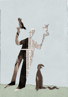
Illustration
1. something that illustrates, as a picture in a book or magazine
2. a comparison or an example intended for explanation or corroboration
3. the act of clarifying or explaining; elucidation.
4. Archaic illustriousness; distinction
The origin of Illustration
1325-75; Middle English < Latin illustrātiōn- (stem of illustrātiō ) theact of making vivid, illustrating. See illustrate, -ion
There are many people in the art industry that want their art to be seen and noticed however we need to push ourselves as technology is upgrading and becoming more and more advanced that illustrators feel the need to push themselves further to make there art more known by advertising there work digitally in lots of different ways. For example; ebooks, iPads, apps, websites etc.
Illustration has broadened throughout the environment using as much space as provided to represent and illuminate the world.
Michael Salu
Artistic Director of Granta Magazine
2012 Varoom
Responding to Salu's assertion illustration has become broadened that illustrators find themselves more involved with the different opportunities and activities that are out there trying to present there work any way they can that will connect with audiences. Technology in a way is taking over always being upgraded, it could be argued that books and handcraft might be dying out because of all this. However it is another way of connecting to other audiences.
Throughout my own work and expanding to the terms of content and media I will try my best to represent my work throughout different outcomes such as a website, which will hopefully support the basis of my work and help me look more professional throughout my practise to people who are in the art industry.
Is Salu's suggestion of a name change for illustration necessary or mere semantics?
No I don't think it is necessary to change the name of illustration because the word illustration already makes you think about art and the things created throughout art rather than speech. For instance; when I think of illustration I immediately associate the word with images, hand craft art models, animation, etc. Illustration is a name I would most defiantly wouldn't change, otherwise if it did I think a lot of people would be confused.
Illustration web is a website full of illustrators from all over the world that represent a wide range of different images and animations used in many ways for different reasons.
Here are a few examples;
Stefanie Clemen

Corinna Ice
Bill Greenhead
Click here for an animation by Bill Greenhead Animation
Sunday, 15 December 2013
Judith Kerr
I watched a documentary on Judith Kerr called 'Imagine: Hitler, the tiger and me' which explored the life of Judith Kerr and how her past, during world war 2 has affected her adolescence and childhood. Which she has been representing throughout her illustrative images in children's books each entailing memories of her life.
Judith Kerr is a German writer and illustrator whom is currently ninety years of age and still manages to uphold that enthusiasm just like when she was a child, running up the stairs excited to carry on with her work illustrating and creating children's books in her own study at home in London. A few of the stories that she has written have been done in such a way to help children understand what she has experienced during her time in Germany.
Judith Kerr was born on 14th June 1923 in Berlin and when she was nine she had to flee from the Nazis, living the remainder of her life in Britain. She has lived a remarkable life that hasn't been easy, yet she has been able to produce a vast range of books. She has a schedule that she keeps to everyday, having breaks between her work and keeping fit by taking long strolls, enjoying the life around her. Friends and other writers have said she is a real fun person to be around especially as she's not living in the past and she is very much in the present with today's society.
Alan Yentob talks to Judith about the way she works and the space she works in, Judith expresses that she wouldn't be able to work anywhere else as this is the room she loves and is comfortable in the study in her own home. She feels she wouldn't know what would happen if she had to work anywhere else.
Here is an image of her working area;
At the moment she is working on a book that takes place in the Jungle , she is having a few challenges in drawing flowers and trees so looks at an artist called Russo for inspiration, she feels that if she thinks of Russo she will be able to do it. Another influence Judith relates to is Fantasy represented throughout a Russian/French artist called Marc Chagall, she describes his images of couples and animals flying. This theme has inspired one of Judith's books called 'My Henry' as she felt this is what the story needed.
Here are some of Chagall's work compared to the work of Judith Kerr;
 Marc Chagall Blue Circus 1950-2 Courtesy Centre Pompidou Paris |
 |
| Over the Town 1918 Here are some images of Kerr's Book 'My Henry'; |
I feel Judith Kerr has written this book in memory of her husband Tom whom died seven years ago.It refers to the adventures they could have together in the afterlife, relating to the women in the story envisioning her life as being lived and all this that is happening is inside her.
Furthermore Alan Yentob suggests that Judith Kerr may be a 90 year old woman on the outside, however on the inside she is still the child that she was when she was younger, as she feels that she hasn't really grown up.
Before the war in Berlin her father was a leading Jewish intellectual and her mother a composer. Judith has written a string of books based on her own experiences throughout her life.
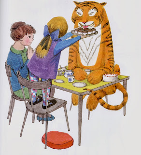
Judith Kerr wrote and illustrated a book called 'The tiger who came to tea', she wrote this book in her own kitchen at home. She has two children called Tacy and Matthew, she would stay at home to look after them and at times things would get very boring, so she took her children for long walks and would return home for warm tea (cups of tea). She was always worried about who might be knocking at her door, so she came up with the idea, "why not have a tiger come for tea" and this is where she came up with the story.
She told this story to her children many times so she knew it off by heart and tried to make a picture book from it in which she has succeeded.
A short synopsis of the story is:
The doorbell rings just as Sophie and her Mummy are sitting down to tea. Who could it possibly be? What they certainly don't expect to see at the door is a big furry, stripy tiger. The tiger consumes all of their food and drinks, leaving the child and her mother with nothing apart from a mess they have to clean up.
The tiger represents a stranger knocking at the door and entering a child's life in the presence of there on home.
Kerr explains how she wasn't sure whether the tiger should be wearing clothes or not, but decided it looked best without.
From Michael Rosen's (a children's writer ) point of view, he expresses that "for children aged 2-3 years why not have a tiger come for tea, as you don't know who's going to knock at the door. However if you were to look at this metaphorically, Who is this tiger? Someone that comes in and starts grabbing stuff taking all the water out of the tap, well he's a tiger what do they do? There dangerous, they eat people and Judith Kerr knew all about dangerous people grabbing things and taking people away from when she was younger from her own experiences. As she knew this could happen, as she was told when she was a young child that her father could be grabbed at any moment either by the Gestapo (official secret police of Nazi Germany) or the SS (the secret service), he was in great danger.
In Conclusion, Judith Kerr has impacted on my work in the way I have reflected in the methods she uses to create her simple , vibrant images. By using my own materials more freely, adding fragments of line and sketches throughout my images. Realizing that I don't have to outline the whole of my image, but just part of it to give my work more of an edge. I have also learnt quite a lot from Judith Kerr, exploring about her life and how she has progressed throughout her work, representing memories and events that she has experienced which she has produced throughout her images. This relates to my self - directed project on 'The Bink family' as some of the events that happen in the story link to some of my own experiences and memories from my own past.
Portfolio review by Rosie Wilman
My Mentor Rosie Wilman gave me a lot of great advice in presenting my portfolio to be more professional, by considering the space I use for my image making sure it is central and there are no shadowing lines at the sides that will intervene with the presentation of my image. Rosie feels the way I have recorded my Pdf portfolio is working well, showing the progression between projects. She has suggested that it would be nice to have a page that shows my working method, representing how I go from a sketch to the finished thing or how I've developed that idea.
Here a few examples of what she means;
Rosie has also suggested to include some of my tree family people in my portfolio as she thinks there ace. Expressing the point to always keep adding to it, improving my work making sure I am able to talk confidently about each piece so that I am ready for portfolio visits.
She was also very helpful in guiding me throughout my critical Journal that I am writing alongside my practical work, reflecting on my processes that I come across. As I am struggling to put it all together in a way it makes sense academically linking quotes and chapters together as well as my reflection of my own work.
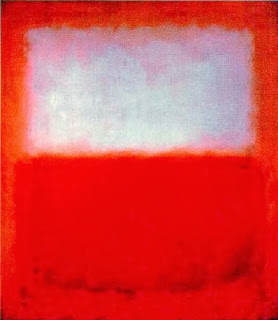
I am trying to receive as much help as I can, Rosie was a big help she has given me a few key artists/thinkers to look at. Such as, Mark Rothko and his idea of 'colour theory' linking this to my own practise in the way I use muted backgrounds throughout my images so the characters in front of the background stand out. Using bright colours for example I have used red and yellow throughout one of my images that I have created of 'Grandad Binks Boat'.
Here are some examples of Mark Rothko's work;
Here a few examples of what she means;
Looking At these two examples she has produced I now understand a lot better the point she is trying to get across and I am willing to try this throughout my own portfolio showing my own progression throughout my work. I didn't realize that this would be an interesting factor to represent during my portfolio.
Rosie has also suggested to include some of my tree family people in my portfolio as she thinks there ace. Expressing the point to always keep adding to it, improving my work making sure I am able to talk confidently about each piece so that I am ready for portfolio visits.
She was also very helpful in guiding me throughout my critical Journal that I am writing alongside my practical work, reflecting on my processes that I come across. As I am struggling to put it all together in a way it makes sense academically linking quotes and chapters together as well as my reflection of my own work.
I am trying to receive as much help as I can, Rosie was a big help she has given me a few key artists/thinkers to look at. Such as, Mark Rothko and his idea of 'colour theory' linking this to my own practise in the way I use muted backgrounds throughout my images so the characters in front of the background stand out. Using bright colours for example I have used red and yellow throughout one of my images that I have created of 'Grandad Binks Boat'.
Here are some examples of Mark Rothko's work;
Muted Blue's
This is Mark Rothko in front of one of his muted images in black and white.
Muted Red's
And here are a couple of my own images representing mute backgrounds contrasting with the image in front;
Subscribe to:
Posts (Atom)




.jpg)
.jpg)
.jpg)
.jpg)
.jpg)


