Her work explores the method of ink, pencil and vibrant colours I feel are watercolour. Her images are unique representing the innocence throughout her characters capturing that playful instinct during her progression of work.
Here are some examples of her work;
 |
| Aesops Fables - The fox, the crow and the cheese |
.png) |
| Jungle Book tiger prowl |
.png) |
| This is my favourite image that she has produced of a fox that was published in AOI images 34 annual 2010 |
.png) |
| Blackbird -published in Spider magazine April 2013 as one of four illustrations for a short story the blackbird and the worm.(S.Krensky) |
I thought I would send her my portfolio , in hope she would advise me on how to improve it and make it better, in which she kindly did.
Anna Violet explains her main experience is on local scenes and children's book illustrations, so this will be the main angle in which she responds to my images. She expresses the point of being subjective and how her favourite mediums are ink and pencil, so has a downer on other mediums. This worried me slightly as I work with the method of collage and thought Anna Violet wouldn't be interested, however she proved me wrong and gave me some brilliant advice.
She first starts off by telling me that she loves the handmade-look I have created throughout my backgrounds and paint marks and my lively childlike/naive compositions. The transparency, colours and boldness of Visual world invent works well. Especially as she expresses that she is a sucker for black backgrounds too. Although she wasn't sure what my image was trying to say.
Her favourite image throughout my portfolio is the composition of Grandad Bink in the Boat, Violet found the energy of the water marks and the effect of torn paper is very effective, especially the way my character is tucked-up in the boat this makes everything seem part of the sea.
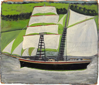
She then asks me a question if I've been influenced by an artist called Alfred Wallis, in which I wasn't as I've never heard of him before my influence for this image was found objects of boats I found around my home and artists working with monsters and exploring innocence and fear in an indicative playful state for example; Sara Fanelli, Judith Kerr, Picasso and Klee.
However when I researched Alfred Wallis I could clearly see the connections of my boat compared to his creations exploring different styles of boats gushing along the ocean. Here are some examples of his work;
Furthermore, My wind in the willows characters looked intriguing she thought I had great lettering too. She liked the soft muted palette and ink work but isn't sure this would appeal to the children's book market. Wondering if the cloth textures need to be more integrated. She suggests I should desaturate the whole of my Badger character and add colours that go across different mediums. Or maybe using a different fabric that fits with badger, thinking about the black and white stripes that badgers have. Violet responds to my wind in the willows characters in needing to be more childlike (no moustache, bigger heads etc.) showing obvious emotions/body language so the reader and child can empathise with.
More over Anna Violet expresses she is confused with the chair represented throughout my image of Baby Bink however likes the use of thread with the painted background suggesting to make it clearer on a bigger image. Then swiftly moving on to my Nana Bink on the phone image which Anna Violet feels the textures and line works well giving off a scary effect. This is great I'm glad my Bink Character made an impression although Nana Bink is meant to look worried so will improve this emotion by adding her worried wrinkles to make a better expression that hopefully gets her emotion across to the reader and various audiences.
Violets comments are great which I will defiantly take on board throughout my own practise and portfolio.
Ending with the point that she is looking forward to seeing my work at the show next spring!


No comments:
Post a Comment