Here are some influences and examples of creative alphabets to help get my imagination going;
Paul Thurlby Alphabet book 2012
Tom Schamp
Mike Perry
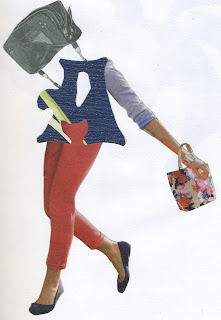
I then tried a few ideas I had of the alphabet using collage, cutting things out of magazines and a unique letter style that I thought suited a kind of vintage look! I really liked this process and the outcomes I came up with, here are a few examples of my work;
I was really enjoying this project however the process for producing the poster seemed to be abit difficult using a rizograph machine to finalise the product. I also found that trying to limit myself to three colours was really hard too, as throughout my work theres lots of colours.
So instead of this I have decided to explore a project surrounding the tv programme 'Blue Peter'.


No comments:
Post a Comment